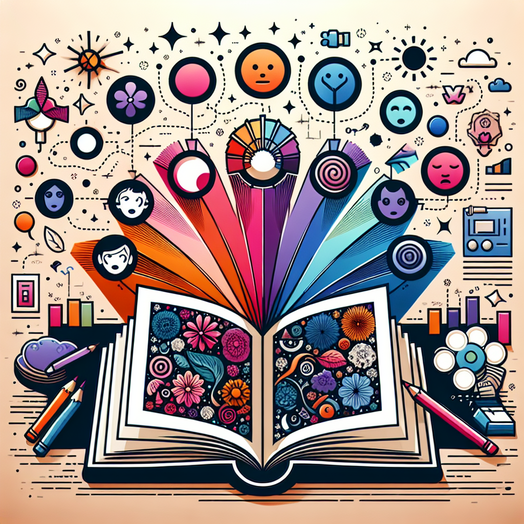
Color is a fundamental element in art that conveys emotions, sets the tone, and influences the viewer’s perception. Understanding color theory is essential for artists, designers, and educators who want to use color effectively in their work. From storytelling in illustrations to mood setting in films, color science plays a crucial role in shaping emotions.
In this article, we will explore how color theory enhances emotional impact, how different colors evoke distinct feelings, and how artists can use color palettes strategically to improve their work. Whether you’re an art teacher, a student, or a creative professional, understanding the psychology of color can help you tell more compelling visual stories.
The Basics of Color Theory
Before diving into the emotional aspects, it’s important to understand the basic structure of color theory:
| Color Type | Description | Examples |
|---|---|---|
| Primary Colors | Cannot be made by mixing other colors | Red, Blue, Yellow |
| Secondary Colors | Created by mixing two primary colors | Green, Orange, Purple |
| Tertiary Colors | Made by mixing a primary color with a secondary color | Red-Orange, Yellow-Green |
| Warm Colors | Evoke warmth, energy, and excitement | Red, Orange, Yellow |
| Cool Colors | Evoke calmness, sadness, or tranquility | Blue, Green, Purple |
| Complementary Colors | Opposite on the color wheel, creating contrast | Blue & Orange, Red & Green |
🎨 Learn more about color theory here: Adobe Color Theory Guide
How Color Affects Emotions in Art
Different colors evoke different emotions. Artists can use this knowledge to enhance their storytelling and create deeper emotional connections with their audience.
1. Red: Passion, Energy, and Urgency
- Associated with: Love, excitement, danger, power
- Best used for: Drawing attention, creating tension, emphasizing strong emotions
- Examples: Many fast-food brands (McDonald’s, KFC) use red to stimulate appetite and urgency.
- In Art: Vincent van Gogh’s “The Red Vineyard” uses red to evoke warmth and energy.
🖌 See examples of red in art: Van Gogh Museum
2. Blue: Calm, Trust, and Sadness
- Associated with: Tranquility, reliability, introspection, melancholy
- Best used for: Backgrounds, corporate designs, emotional depth
- Examples: Tech companies like Facebook, Twitter, and LinkedIn use blue to symbolize trust.
- In Art: Pablo Picasso’s “Blue Period” paintings express loneliness and sadness.
🎨 Explore Picasso’s Blue Period: Museo Picasso
3. Yellow: Happiness, Optimism, and Caution
- Associated with: Joy, creativity, energy, warmth
- Best used for: Highlights, attention-grabbing elements, positive storytelling
- Examples: Post-it notes and Snapchat use yellow for a cheerful and energetic feel.
- In Art: Claude Monet’s “Sunflowers” use yellow to symbolize warmth and vitality.
🖌 Discover Monet’s Sunflowers: National Gallery
4. Green: Nature, Growth, and Harmony
- Associated with: Health, freshness, stability, peace
- Best used for: Environmental themes, relaxation, stability
- Examples: Starbucks and Whole Foods use green to represent freshness and sustainability.
- In Art: Landscapes and eco-conscious designs often use green tones.
🌿 Explore eco-friendly designs: Canva Green Color Palettes
5. Black and White: Contrast and Simplicity
- Black represents: Mystery, elegance, sophistication, darkness
- White represents: Purity, simplicity, emptiness, innocence
- Best used for: High contrast, minimalist design, strong emphasis
🖌 Minimalist color psychology guide: 99Designs
How Artists Can Use Color for Emotional Storytelling
Whether you’re creating a painting, designing a website, or illustrating a children’s book, understanding color psychology helps enhance emotional impact.
1. Using a Color Palette for Storytelling
A cohesive color palette helps establish mood and consistency in visual storytelling.
- Warm colors (red, yellow, orange) → Create energy, excitement, and warmth.
- Cool colors (blue, green, purple) → Evoke calmness, mystery, and depth.
- Monochrome (black & white) → Often used in emotional or vintage storytelling.
📌 Try this online tool: Coolors Color Palette Generator
2. Contrast & Emphasis
- Use complementary colors (opposite on the color wheel) to create contrast and make key elements pop.
- Example: A blue background with an orange subject draws attention to the main focus.
🎨 Find color contrast ideas here: Adobe Color
3. Cultural Meaning of Colors
Color interpretations differ across cultures.
- White (Western cultures) → Purity & weddings vs. White (Eastern cultures) → Mourning
- Red (China) → Good luck vs. Red (Western cultures) → Danger or passion
🌎 Learn more about color symbolism: Smithsonian Color Meanings
Conclusion
Understanding color theory allows artists, designers, and educators to enhance emotional impact in their work. By strategically using color, you can tell stronger stories, set the right mood, and connect with your audience on a deeper level.
🔹 Want more free art resources? Explore lesson plans at BADA Education


